The Importance of Scale and Composition
 Developing a working knowledge of Photoshop can take a couple of months of intense practice. With that amount of time you can get to grips with the Layer system, Masks, Adjustments and the Pen Tool – the real meat of the software. The question is, how do you take your work to the next level? After examining a large selection of composites by up and coming digital artists (CCCU, UK) – I have identified scale and composition as being the primary areas for development.
Beyond software knowledge, there are other avenues to explore if you are interested in creating fine-art with Photoshop. Developing a visual awareness will take your work to the next level, enabling you to manipulate the flow, energy and direction of a piece. Much of the theory we use is borrowed from photography and natural media – but these universal truths are excellent guidelines to assist in the creation of better work.
Scale & Hierachy
One of the main issues I have encountered when examining student work, is the sense of scale and hierachy – what element of the composition is most important, and how does it relate to the supporting elements? More often than not, it is merely a case of the student making the ‘focal-point’ or central figure / object larger in scale, increasing it’s prominence and authority within the hierachy of elements. Let’s take a look at a few examples to flesh this idea out..

Paint it Black by Daunhaus (DeviantArt)
When looking at this image, what would you deem the most important ‘element’ to be? Due to the scale, position and prominence – most people would say it is the figure, and they’d be correct. All the additional elements and the background are scaled and arranged to support this.
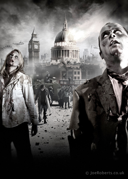
Zombies by Geodex (DeviantArt)
The same rings true in more complex composites. Even though there’s a lot more going on here in Geodex’s ‘Zombies’, the elements are arranged in a hierarchical manner. Of utmost importance are the Zombies, scaled accordingly – with the supporting elements hanging back, not overriding their prominence.
Take a look at some of your favourite pieces and examine how much of the frame the focal figure represents. This notion may seem to be trivial to some, but its a skill that is criminally under-represented in those starting out. Your focal point drives the intent of your work.
Rule of Thirds
Anyone who has been involved in the visual arts may have heard this term bounced about at some point.. Rule of thirds is an extremely simple device that can help you position and scale your elements for maximum impact. The basic idea is to split your image into 9 equal sections with a grid, and then use the lines or intersections to position your elements.
For instance, you could use a horizontal grid-line to position the horizon, or a vertical grid-line to position a vertical structure like a building or figure. Most commonly used, is the ‘intersections’ often used to highlight points of interest, in figurative work usually the eyes of the model.
Why do it? For starters, rule of thirds is a great way to direct scale in a composite as mentioned above. The biggest benefit of rule of thirds though, is the notion of visual engagement or dynamic energy; the fact that your focal elements are slightly ‘off-centre’ and less static. There is an inherent simplicity to the concept, but it just seems to work so well.
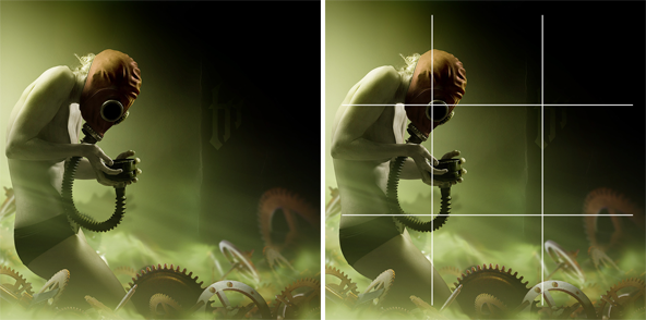
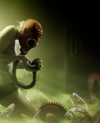
Metal Breakfast by Conzpiracy (DeviantArt)
This example shows how the top-left intersection was used a guide to position the most important focal point of the image – the mask’s eye hole. That hot spot at the top-left is a great place for important visual information as that is where the eye naturally begins reading ( in the west.. )

God Shadow by horhhe (DeviantArt)
Experienced Photographers usually make great use of this device for framing and composing elements. In this instance, the lower grid-line is used as a point of reference for the horizon. As opposed to being ‘dead-centre’, there’s a feeling of visual imbalance that is a lot more engaging, even in a still piece like this.
Rule of thirds isn’t carved in stone, merely use it as a tool to frame and compose your elements when required. There are some instances where you may not use it at all, particularly figurative pieces that are perfectly centralised for quiet impact; however ye olde rule of thirds may creep in there for positioning of props, elements or backgrounds..
Energy & Direction
Now we start venturing into more esoteric territory, energy and direction is basically the ‘flow’ of a piece.. Where do your elements start and end? Do the combined elements form geometric shapes such as triangles or circles? Centralised composites usually denote a sense of calm whereas angular composites often give a sense of energy or activity. Even with ‘still’ figurative work, you can increase visual engagement by playing with lines of direction and flow. These considerations can help direct your stock searching endeavours, as you may start seeking images that support a certain energy that you are looking for.
This is an area of composition that I am starting to explore more in-depth, so keep you eyes peeled for future articles!
Review
To me, the study of fine-art techniques in photo manipulation is the step toward elite-level work. Many people attain technical proficiency in the software, but lack the visual tools to compose their work in an engaging manner. I hope some of the observations in this article were useful, as ever please feel free to share your own tips in the comment section below


