


Tips on Selecting the Best Color Scheme for your Project
Whether you’re designing a website for a certain up-and-coming personality or just doing some Photoshop or Illustrator projects for kicks, you can never underestimate the power of color schemes in finding the right colors for your project.
There are so many sources for combination of colors for a specific project. For starters, you can just look out of your window and see which colors look good in your eyes and which ones look revolting when combined; nature can be a good source of inspiration. However, there are more sophisticated tools in choosing the right color combinations, like the products offered by Pantone, where you can easily see which colors look good when juxtaposed. But if you are looking for other places to look for color schemes, here are some tips.
A poker day out
Visiting a casino or a poker joint doesn’t only offer a good time. Other than sweeping poker tables and hoarding chips from unfortunate players, a casino can also provide you with some of the most interesting colors around. This is because they are designed to be eye-catching to entice people to go inside, exchange cash for chips, and sweep tables. If you have a casino or poker-related project that requires the gaming “vibe”, then look no further than a poker table. For your base color, you can use felt green (#578F05), saffron (#DE4E31), pebble (#E6E1E1), and burl (#302927). If you want to add a darker shade by of green, reduce felt green to 13% lightness and you’ll get (#2A4502). While partypoker.com has already used this color scheme, a fitting scheme that reminds people of poker tables and card games, you can still use these or modify them a bit to suit your project.


Kubrick’s dystopia
If you’ve seen the Stanley Kubrick classic A Clockwork Orange, then you will probably be familiar with the different shades of oranges found in the film. In this scheme, there are four shades of orange used, starting with a variant of orange almost identical to dark orange (#FF9900), followed by a shade with 65.1% lightness (#FFB84D), and another shade with 55.1% lightness (#FFA31A). Aside from these monochromatic shades of orange, this scheme also uses a shade of nude (#FFBA76) and black (#000000). You can use this scheme for projects like retro posters drawing inspiration from Russian Avant-Garde.


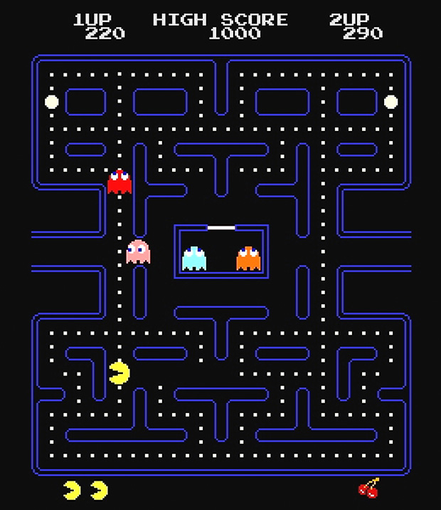
Pac-Man’s nemesis
Sometimes, the colors associated with our childhood can be good sources of color schemes, like those from vivid books with wild colors and shapes, movies of cats and mice chasing each other, and video games that are so simple yet mind-blowing. Pac-Man, our favorite chomping buddy, can give catchy colors for your next project. Pac-Man (#FFFE03), Inky (#1BB1E6), Blinky (#ED1B22), Pinky (#F599B2), and Clyde (#FF9F00) will breathe life to your project as you remind people of their joyous childhoods.


