Web 2.0 Soft Floating Font Tutorial
So if you are like most of us designers who have hoped onto the Web 2.0 bandwagon you are sure to realize that gradients are god in the web 2.0 world. This tutorial will show you the basics of web 2.0 gradient font design to mimic a floating font design.
Start of by creating a new document, 500x 500 px should be enough. Grab your text tool and write the name of your company (or a dummy name if you don’t have one). One important thing to note when making web 2.0 logos is that choice of font is critical. Even if you get the style effect down right, if you don’t have the right font, it will not look good. Even if a font works well for certain text, it might not look good for others so always play around! With that said, you can always expand your font archive, check our Links and Downloads page for good websites. For this tutorial we used the font “Franklin Gothic Demi Cond”.
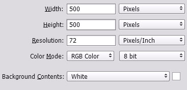
After you choose your font, we need to make some touchups to the typography. Open up the “Characters Window” by going to Window > Characters. Now before you go on start playing around with this box, be warned, if you make a change Photoshop will not revert to the previous settings unless you change it back. So if you make a change, don’t forget that you did so because all your future typing will be affected by the changes you made! With that said, lets play around with the horizontal character spacing. A key component of web 2.0 design is compactness. Nice smooth fonts that fit together nicely is a must. With that said we squish up the characters by decreasing the horizontal spacing value till you find a level which you prefer. Our results are shown below.
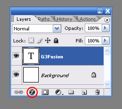
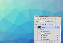
Now that we have the bare bones, lets get down to business and create the glossy gradient effect that we want. Open up the layer styles popup by clicking on the stylish “f” button on the layer window and choosing Gradient Overlay. Double click on the color bar to choose the colors for your gradient and set them as shown below. For the effect we are about to do it is nice to have the darker of the two colors on the top, since we will be adding a gloss layer that will lighten it up and make it more visible. We choose the following two colors for the gradient:
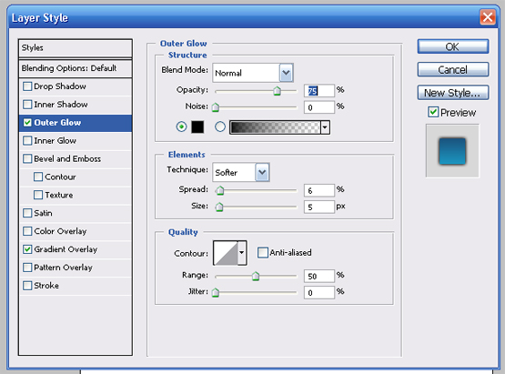
Next click on the Outer Glow text and use the following settings. Note depending on the size of font you used you may need to either lower/higher the size of the outer glow since we don’t want too much of it. The color is set to black by the way.

Next make your way over to the Stroke feature and use the following settings. Once again you may need to lower/higher the size of the stroke so that the outer glow barely shows behind the stroke. This gives it that nice floaty appearance.

Almost done, looking pretty good already eh? Now lets add that gloss to give it a nice glassy touch. Select the rectangular marquee tool, hold down the CTRL key and click on the font layer. The font should now be selected by the marquee. Create a new layer (by clicking on the Create a new layer button in the layers window); and on the toolbar, and set your foreground color to white. Select the gradient tool and using the secondary toolbar, choose the gradient style shown below.
Now, with the outline of the font still selected by the marquee, on the blank layer you just created drag down the gradient from the top of the text till some where around midway down to create the following effect:

Now choose the rectangular marquee and delete the bottom half of the gloss you just created. Play around with the opacity of the gloss layer, we set it to 50% as shown below:

Lets add a slogan underneath the text to create a logo. The smaller the font is, the harder it is to get a nice floating effect so stick to plaint text with a color that blends nicely with the existing text. Using the character window, horizontally space out the text so you get an effect similar to what is shown below.

We still see that white space exists to the sides of the slogan so lets select the brush tool (size: 1px) and draw a line as shown (on a new layer ofcourse).
Select a large soft eraser brush to fade off the ends of the line and use the marquee to delete the section of the line which goes over the text and your done!
A great text effect perfect for many web 2.0 logos.


