


Advanced Color Correction Tutorial
This tutorial shows you an advanced method of evaluating your photograph’s color accuracy and making the proper color correction adjustments. It is a more sophisticated technique of removing unwanted color casts, but the result’s will knock your socks off. Does require some basic knowledge of Photoshop. For this tutorial I will be working in Photoshop CS3 using a stock photograph that came with Aperture 2.
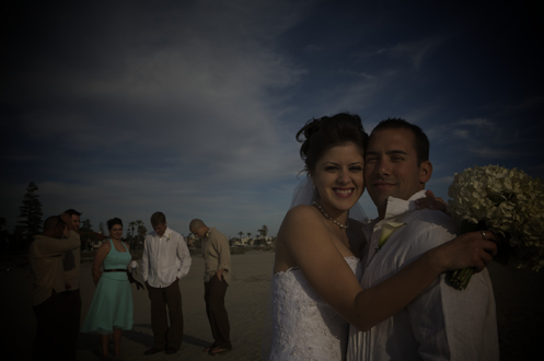
The original
As you can see above, the original photo is much too dark…
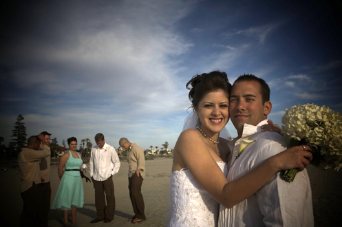
But even with some basic ‘Levels Adjustments’ to brighten up the original, even though the image is much improved, we can now see a red color cast in the people’s faces, in the lower part of the wedding dress and in the white shirt of the man in the background. If you don’t see it now, you sure will by the end of this tutorial.
Preparing Photoshop
Open the original photograph in Photoshop. Open your ‘Info’ palette (F8 on a Mac or Window > Info) and make sure your ‘Layers’ palette is showing, if it’s not already.
On the bottom of your ‘Layers’ palette you will notice a half black, half white circle, which is your ‘Create new fill or adjustments later’ button. Choose ‘Curves…’ from the pop-up menu.
You should now have your a ‘Curves’ window open like the one pictured below.

Let’s get into it…
First we need to find the “whitest” white in the photo. Within your ‘Curves’ window, check off ‘Show Clipping’ – This will make your photo look funky!
Now click on the highlight handle on the diagonal line (see below). This will change your image to all black.

Start by dragging the ‘ highlight handle’ (circled above) to the to the middle of the histogram until you start to see your whitest whites appear on the image. You might start to see various colors of red, yellows and blues, but what we are looking for are the first whites to start to appear on the image.
Once you see the FIRST WHITE areas start to appear, stop dragging the handle. You should see something similar to below on your image. NOTE: The below image is zoomed in to demonstrate the white areas.

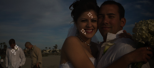
Locating the white points
Now it’s time to starting setting points. The first two points (point #1 and #2) we’ll be setting is to find the whitest whites in the image, without being blown out (or overexposed).
It is important to note that you should zoom way in when setting these points. It’s easy to mistake the white areas when your actually on a yellow. While holding the Shift key on your keyboard, click on two different white areas. They should create circles with tiny numbers next to them as seen below:

Locating accurate skin tones or neutrals
The next two points we will be setting are for evaluating unwanted color casts. For this tutorial we will be testing them through the skins tones, but the same can be done through neutral greys in any image.
First, bring your ‘highlight handle’ back to its starting point on the right hand side of the histogram AND uncheck ‘Show Clipping’ — This will make your photo look normal again.
Now locate 2 areas on the skin tones that are well lit and still have some detail (we don’t want areas that area over exposed and lacking detail). It helps if you squint when looking at the photo, but for this example I selected the bride’s well lit forehead and her right check (our left since we’re looking at her).
Using the same techniques as above select two more points (point 3 and 4). See below:
The Info palette
If you now look at the ‘Info’ palette you should see your four points you just set, with values next to R, G and B. We want to concern ourselves with the numbers to the right of the / symbol.
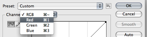
Setting a good white point
Paying close attention to points 1 and 2 on your ‘Info’ palette, change your ‘Curves’ window channel from RGB to Red :
Now move your ‘highlight handle’ around until you see both point 1 and 2 change on the ‘Info’ palette. Make this number 242!
Continue this for both the Green and Blue channels, until points 1 and 2 of your Info palette area 242 — If your having difficulties setting both points at 242, try to get them within 5 points of each other.
Why 242?
242 is a good white — it still has plenty of detail without being blown out/ overexposed and is not too dark where you don’t get “pop!” to your picture. Your photo should now have better whites, and in this particular photo, much improved lighting throughout. It also helps a bit in removing color casts. But continue reading below for more on that.


Getting rid of those unwanted color casts
Now it’s time to remove those unwanted color casts.
In the above photograph you might notice some red casts showing on the wedding dress or in the skins tones. If not, don’t worry… you will at the end.
Unlike the magical number of 242 being used for a good white point, there is no secret number for skin tones, BUT there is a method to the madness:
Red is greater than Green and Green is greater than Blue. The value (number) between Red and Green should be greater of that between Green and Blue. Little confused? Don’t worry we will do it together…
Adjusting RGB Channels for the skin tones
Using the same methods as above for ‘Setting a good white point’ by dragging the ‘highlight handle’ of each channel, we are going to do something very similar similar.
This time before we start adjusting the highlight handle for each channel we need to analyze the ‘Info’ palette for points 3 and 4.
We need to adjust the points so that Red is greater than Green, greater than Blue and the number between Red and Green is double that between Green and Blue without changing the Info setting values for point 1 and 2 (our white points).
Here’s what my Info palette looked like before they were adjusted:
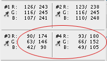
The numbers we’re concerned with is to the right of the / symbol. Although Red is greater than Green and Green is Greater than Blue in points 3 & 4 of the above image, the distance Red and Green is NOT greater that of Green and Blue — it’s actually opposite of what we want, so we must fix this WITHOUT changing the other channels for points 3 & 4 AND WITHOUT effecting points 1 & 2. Here’s the trick:
Find the channel that you want to adjust (in this example, it’s the Green channel).
First, make sure you’re on your Green channel in the ‘Curves’ window and while holding down your Command (Control on Windows) key click on point #3 on your photograph. This will create another point of your ‘Curves’ line. See below:

Drag this new point around and you will see your Green channels in your ‘Info’ palette changing.
Set them to meet the “Red is greater than Green…” requirements. You probably will have to make other adjustments to the other values, so repeat the process for each Channel (Red, Green and Blue).
Here’s what your Info palette should look like after you made the White Point and Skin tone adjustments:
NOTE: Each photograph is different so the numbers for skin tone will never look be the same values.

That’s it! We’re done! I hope you’re not too confused by this point. If so, go back and keep on trying… it will eventually make sense.
Let’s compare
Original, with only a basic Levels adjustment:

After the tutorial:

Notice the huge difference now? That nasty color cast is gone! Here’s a closer look of the dress:

Feel free to share your thoughts or methods of color correction. Also, let me know if you’ve had success with the tutorial.


