True Blood Photoshop Vampire Tutorial
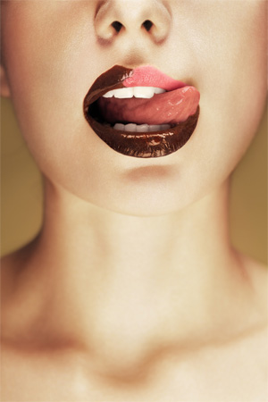
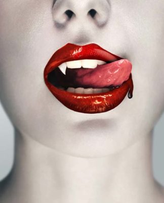
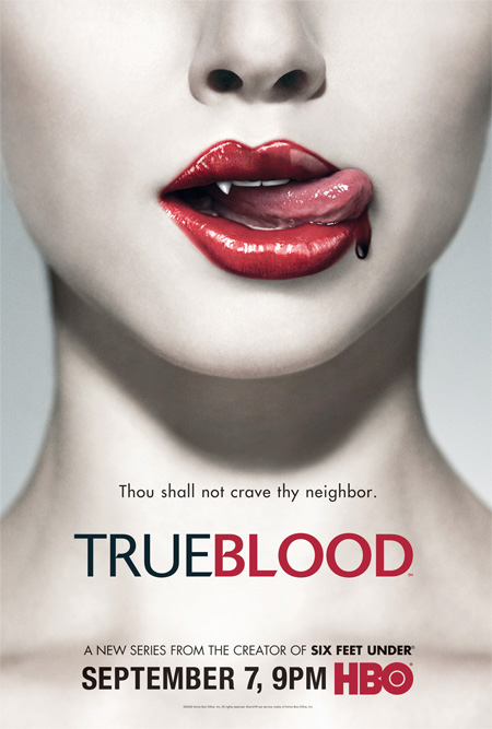
Admittedly, I haven’t actually seen the TV show ‘True Blood’ ( too busy writing tutorials! ), I do however love the marketing behind the series, particularly the iconic poster featuring the vamp lips. This approach is just my style of macabre art; elegant, subtle and sexy! Implied horror very often carries greater weight, and that’s what I like about this piece. Here’s my humble attempt at reproducing this style, I hope you enjoy.
Reference Material
We’ll be referring closely to the original poster throughout the walkthrough, so head on over to geekshow.us to grab the amazingly high-res version of the poster for reference. Click image below:
Stocks
I managed to find an image pretty close to the original on Fotolia, Lips with Chocolate by gaii (#30224807). Even though it’s not ‘perfect’, it’s definitely workable for this concept:
This image is lo-res, if you would like to use it – please download direct from the photographer at Fotolia
For those that would like to practice the techniques, and not use the Fotolia image – I have found an alternative at DeviantArt that can be adapted to work with the walkthrough process. ‘Bubblegum Cotton Candy’ by C-F-Photography ( DeviantArt ) :
First things First..
Because the Fotolia stock image I have chosen have the lips partially darkened with chocolate, the beginning steps will be a little tricky, but not too much bother To start, open your image in Photoshop – and create a duplicate layer of your image ( Ctrl/Cmd+J ). Hide the duplicate layer – it’s good to have this as a backup if things go wrong.
Lip Colour
We’re going to undertake a little doctoring to get the lips looking a little more uniform for the Fotolia stock image. To do this, we’ll selectively darken the ‘normal’ lip areas to achieve a painted look, without destroying the highlights. Create a selection around the lip areas you would like to apply the lipstick darkening effect, in the example I used the Pen Tool to create a precise selection:
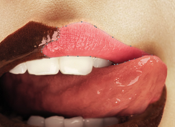
Convert your path to a selection ( right click path, ‘make selection’ ), copy the selected area to a new layer ( Ctrl/Cmd + J ) – you will now have a copy of the lip area above the original stock layer ( you may want to rename this layer ‘lips’ to keep track of things ). With this new layer active, go Image > Adjustments > Shadows / Highlights .
The settings you use will depend on the stock image, here are the values used for the example. Use your eye to determine the richness you would like to achieve:

At this stage, it isn’t going to look perfect, but we’re on the path to victory:

With the ‘lips’ layer active, change the layer mode to ‘Multiply’. Duplicate the lips layer ( Ctrl/Cmd+J ) and change the layer mode of the duplicate to ‘Vivid Light’. Our layer stack should be looking like this:
• Lips – Vivid Light – 100%
• Lips – Multiply – 100%
• Stock Layer – Normal – 100%
• Stock Layer (Hidden)
Here’s how were looking so far:

The transition is looking a little ugly at this point, so for the example I tidied up the ‘overlap’ a bit with layer masks and a soft-edged brush.
Next we need to create a ‘mask’ for the general lip area – to do this I often create a new layer, so it can be used again when needed further down the line. Create a new layer at the top of the stack, name it ‘Lip Mask’, create a selection around the entire lip area, and fill with white. Again, I used the Pen Tool for it’s precision:
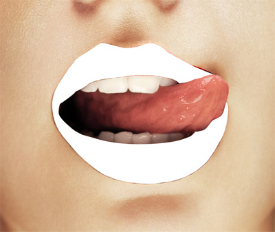
You can now hide this ‘Lip Mask’ layer. Holding Ctrl/Cmd, click on the ‘Lip Mask’ layer icon, this will create a selection based on the layer contents. With this area selected, you can now add an Adjustment Layer or fill with a colour of your choice on a new layer ( set to ‘Color’ blend mode ). This adds a uniform colour to the entire lips, just a little extra tweak to get the vibrancy that you desire. In the example I used a Curves Adjustment Layer, set to Color blend mode:

Darken / Lighten
For the perfectionists amongst you, you may want to go an extra step to really accentuate the dark regions of the lips, to match the original True Blood poster. Hold Ctrl/Cmd and click the layer icon for the ‘Lip Mask’ we created earlier, this will make a selection. Create a new layer at the top of the stack and sample a dark red from the lips using the Eyedropper Tool. Change the layer mode of this new layer to Multiply. Using a Soft-Edged Brush (B), paint in the areas where you would like to be darkened.
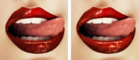
For the example, a number of Multiply layers were used to build up the effect gradually, using different layer Opacity when necessary. Very subtle, but worth it.. Here’s a before and after the darkening:

To lighten areas of the lips, create a new layer at the top of the stack, set the mode to Overlay. Use a Soft-Edged Brush (B) set to white, and paint where you would like the lips to be brightened:
Gloss
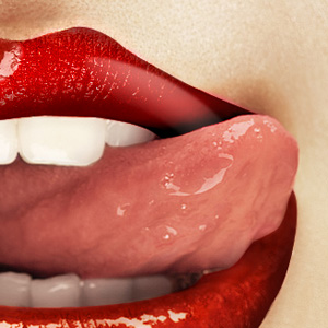
I wanted to add a dash of gloss in there to make the dry area of the lips seem a bit more wet. To do this, create a new layer at the top of stack and change the blend mode to Screen. Sample a colour from an existing highlight using the Eyedropper Tool, use a tool of your choice add the gloss highlight. For the example I used the Pen Tool (P) to create the shape, and then softened the edges using a Layer Mask :
The Fang
We’re going to paint the fang in to the image using some simple digital painting techniques. Sample a light tone from the teeth using the Eyedropper Tool (I).
Create a new layer above the stock image in the stack, create the outline of the fang using the Pen Tool (P); right click on the path and select ‘Fill Path’, use the foreground colour you just sampled to fill the path ( delete path once done ).
Hold Ctrl/Cmd and click the layer icon of the new fang layer to create a selection. The idea here is to build up the tones by sampling colours from the edges of the teeth using Eyedropper (I), and painting in with these colours at the edges of the fang. A good way to work is to have the Brush (B) active and sample colours by holding the Alt key ( which will switch Brush to the Eyedropper ). This is where artistic prowess comes into play!

The fang will look a little flat without a highlight; wet objects are great reflectors so we definitely need a ‘specular’ in there! To create the highlight, make a new layer above the fang and use the standard Lasso Tool (L) to create the general highlight shape. Fill this selection with white, and then use the Smudge Tool ( strength around 20% ) to blend the highlight in.
The fang will look pretty sharp at the edges, so you may want to soften the edges with the Smudge Tool at low strength to make things look a little more natural:

The Skin
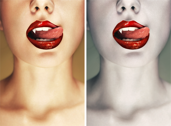
In comparison to the Vamp, our model has a healthy summer glow; which we obviously don’t want! To change the complexion of the stock model, I used two Adjustment Layers to tweak the skin tones to something a little more ‘undead’
One great method for changing tones, without obliterating pixel information is to use a Curves Adjustment Layer – and tweaking the individual R, G & B channels. When adding your Adjustment Layer, ensure you have removed the entire mouth from the mask using a black brush or something else, we don’t want these colour changes to affect the lips and teeth etc. Heres a look at the Curves Adjustment Layer used:

As well as a Curves Adjustment Layer, you may want to add a Hue / Saturation Adjustment Layer to pull the saturation down a tiny notch, for that alabaster aesthetic. Again, ensure the entire mouth area is masked out so the adjustment doesn’t desaturate that area. Here’s before and after colour processing:
The Blood
Some folks may be tempted to copy the blood from the original poster, and cheat it into the new composite, but that’s not how we roll! We’ll be creating the blood from scratch using digital painting techniques once again.
Sample a mid-red tone from the blood drip in the reference image. Create a new layer at the top of the stack, using the Pen Tool, create the outline of your blood and then fill it with the red colour you sampled ( right click on path, select ‘fill path’ ). Create a selection based on this ‘blood’ layer ( Ctrl/Cmd + click layer icon ) – using the reference image, sample different shades of the blood and manually paint it into your selection on the same layer.
Once your drip is looking sufficiently ‘bloody’, deselect ( Ctrl/Cmd+D ) and blend the edges using the Smudge and Blur Tools. At this stage, the blood will look pretty ‘flat’, so on a new layer set to Sreen mode paint in the highlights – sample highlight colours from the reference image to get the correct tones:
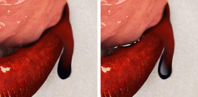
Anything wet always bounces back the light. The above blood highlight looks crisp because the Pen Tool was used to create the general shape
Additional Tweaks..
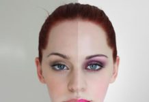
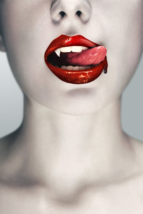
I added a few flourishes not included in the walkthrough ( as Im starting to feel pretty tired! ), a new background and some colour-work on the tongue – nothing major. Here’s a look at the before and after, as well as the final piece:

Review
A bit of a beast this one, with loads of techniques thrown in. Hopefully there was something useful amongst the barrage of information! Got your own horror photoshop tips? Feel free to share in the comments section below.


